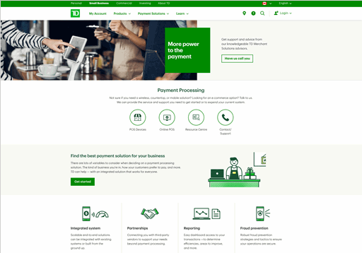
TD Merchant Services Shopping
OVERVIEW
Challenge
TD Merchant Services has many different payment solutions, including countertop devices, a web retail platform, wireless payment devices, and other services to offer merchants.
Unfortunately, the current Merchant Services website experience isn’t doing a good job to help prospective merchant customers find devices and services and then contact TD to purchase (this section will not include ecommerce, as solutions are more complicated and require actual contact to purchase).
Delivered
A new shopping experience that delivers on guiding merchants along the path to identifying the right products and services that aligns with their business needs.
Mini Discovery
Because budget for this discovery was limited, there were no user interviews or usability testing baked into the timeline, so this effort was referred to as a Mini Discovery, with all risks noted. Still, a great deal was found, and with analytics employed going forward, there is an opportunity to deduce how well the new section is faring against the old.
Knowledge gathering: Market research
Since we were not able to talk with users, it made sense to look at research about them, so a part of the knowledge gathering included a report on the state of merchants’ mindset and abilities, from McKinsey & Company Global Banking Practice 2020 Global Payments Report.
3 important things from the report:
Understand SMEs (merchants) in depth
Leverage internal & external data to segment them based on their specific needs.
Give SMEs what they need
Develop bundles of products and services that answer the specific needs of each segment.
Let SMEs serve themselves, but deliver knowledge when they need it
Set up direct channels with self-serve access tools for cross-selling and day-to-day service activities, while increasing technical knowledge and effectiveness of the salesforce.
Knowledge gathering: Stakeholder envisioning workshops
Next, we interviewed stakeholders to find out what issues and opportunities they saw with the current site, and, placing themselves in the users’ shoes, what would make the experience better. These were held using webex, since during the pandemic, a regular workshop wasn’t feasible.
Some things we heard:
“How do we differentiate? TD does not do a good job calling out our strengths. Need to educate our merchants around what they need to think about”
“We don't put an education lens on what we talk about, when a lot of merchants want to know what we can offer”
”Understanding which solutions best fits their needs. Do they have the right solution?”
Needs assessment results
We did an exercise to distill all that was heard from stakeholders and from the market research, to find common ground and disparities, in what was hopefully the voice of the merchants:
“Make the solutions for my business simple and easy to understand.”
“Provide different levels of information as it pertains to my business needs.”
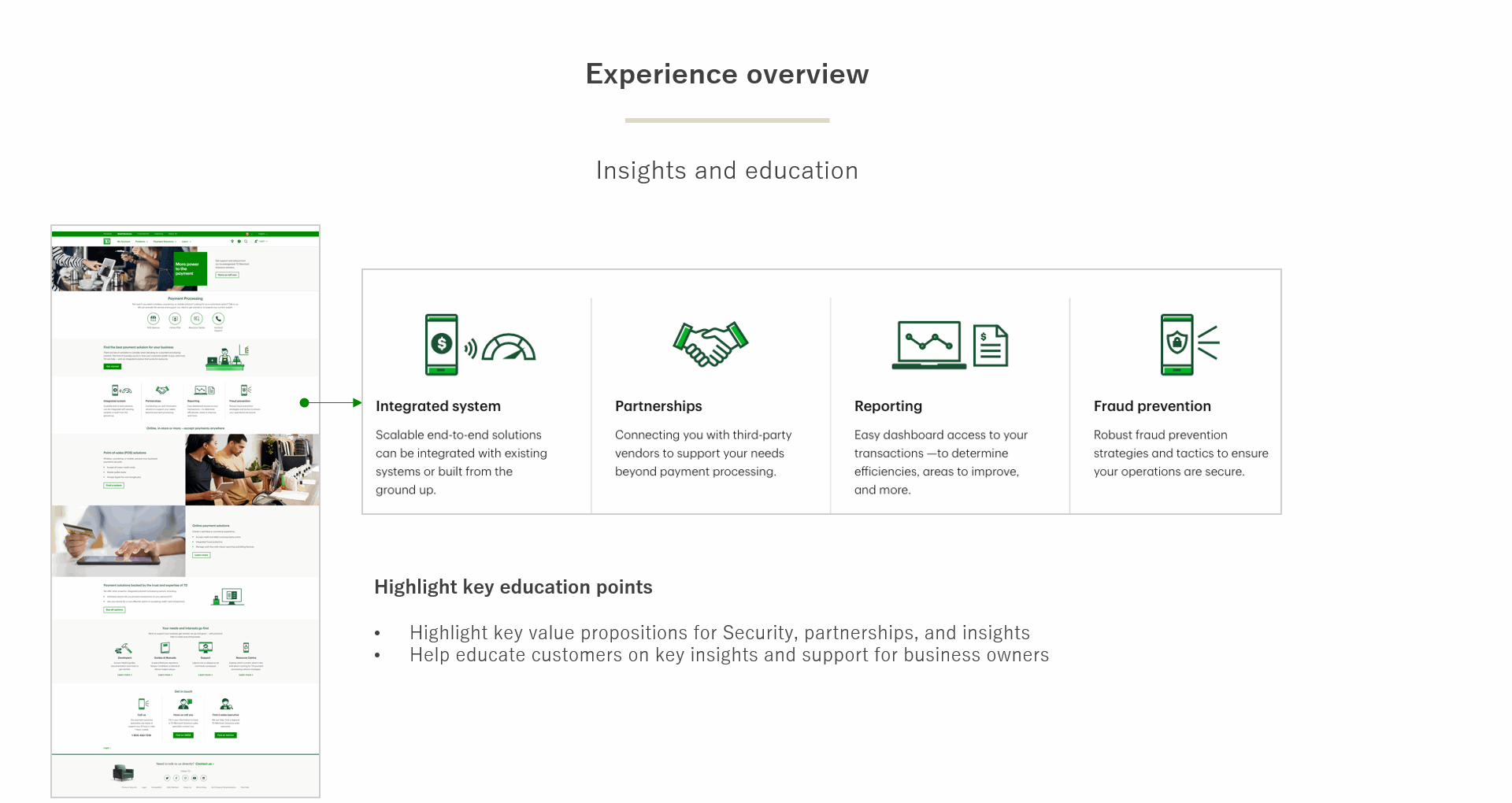
“Help me understand the unique benefits, uses and outcomes of each product.”
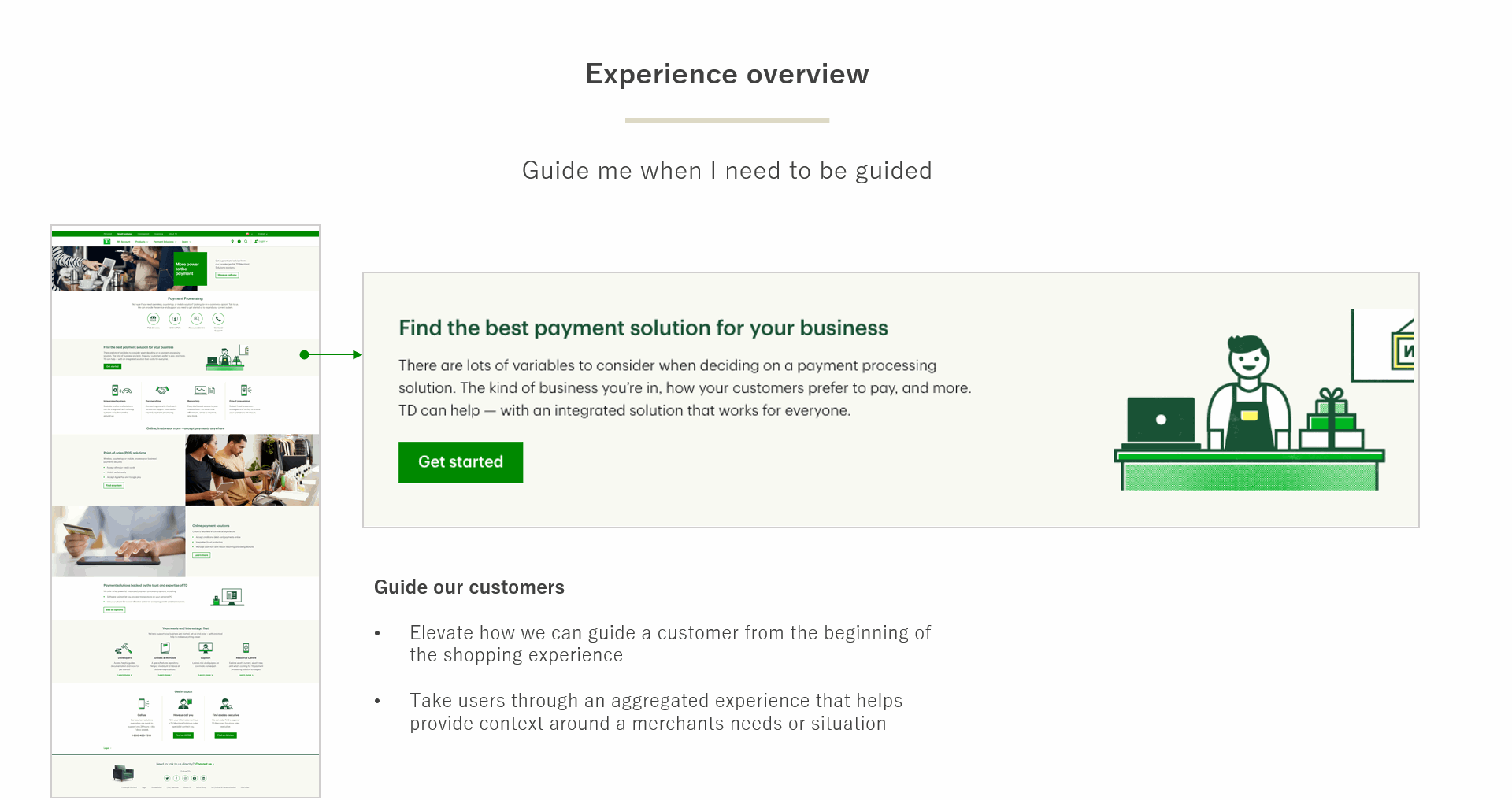
“Guide me when I need to be guided, but allow me to evaluate for myself.”
“Receive insights and advice from Merchant Services specialists.”
“Meet or exceed competitor offerings.“
Opportunity Areas
I took all the information discovered in the previous exercises and made 3 meaningful areas that needed to appear in the new design, that I call Basic Opportunity Areas. This was to ensure I touched on these areas throughout the experience. This exercise was done using sticky notes, but I have no pictures of the process.
Sell
Products don’t sell themselves
Make it easy for the value of the products to be understood quickly, and differentiate them appropriately.
Make room for beauty
This is a marketing area with some actual products, but with no way to purchase on the site (similar to car presentation), so the idea of the product must linger top of mind. Ensure space for strong visuals to help in a visceral, meaningful way.
Information is key
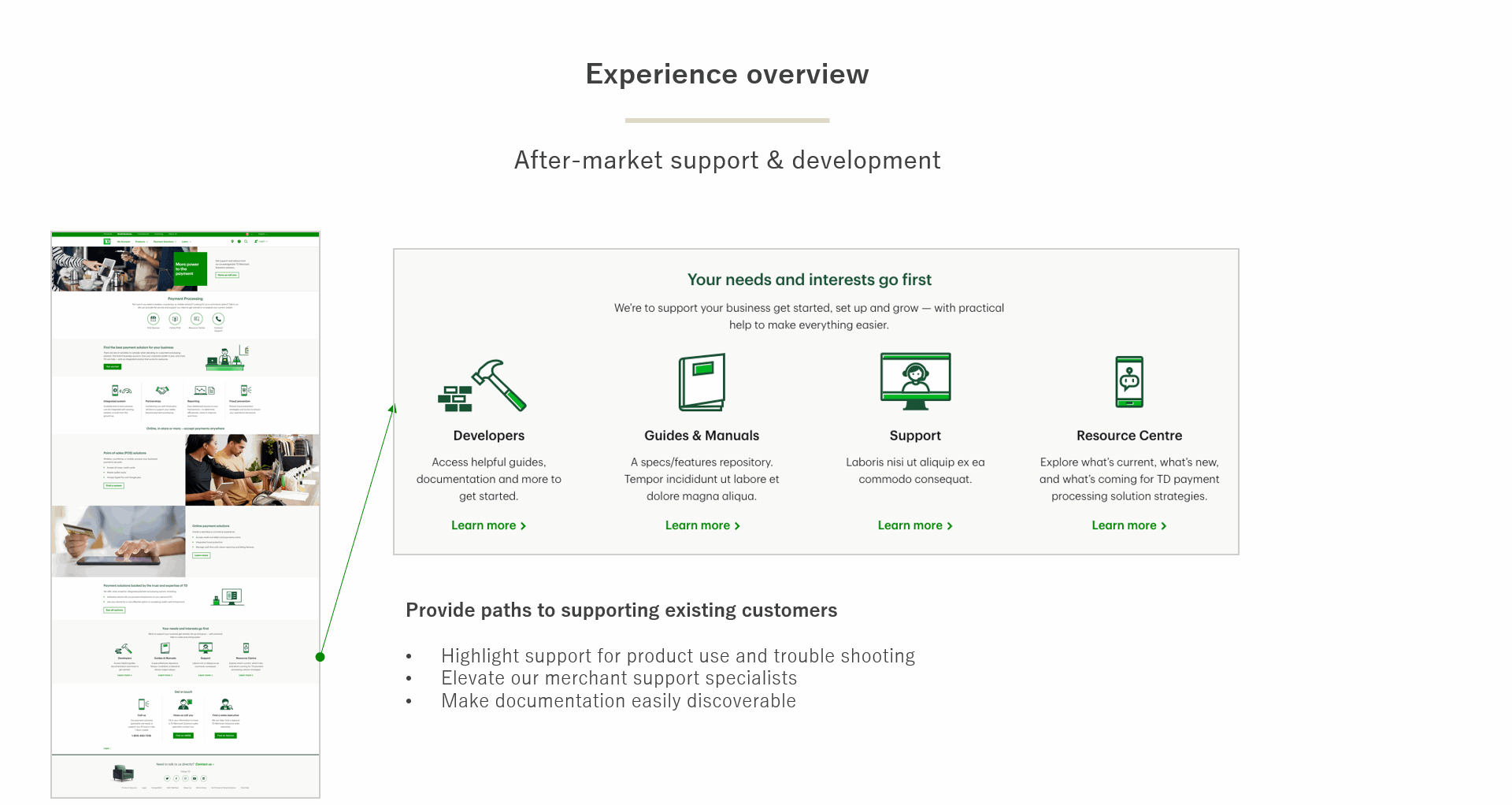
Provide adequate information on the products from a before-market and after market perspective. Understand that users visiting will have differing levels of technical knowledge, so do not assume they are experts or that they do not understand (support both levels).
Guide
Support Decision-Making
Merchants want easy, simplified solutions; align products with need-based positioning for quick identification. Provide comprehensive recommendations. Let prospects refine their choices based on use cases.
Contact
Reduce Barriers
Minimize barriers to contact Merchant Services; appropriately elevate contact. Always include accessibility concerns.
Experience Principles
These principles are just a listing of boiler-plate, non-negotiables to keep in the back of my mind as I go about designing the actual wireframes. They do change with each project, depending on need, but mostly, they tend to stay the same within the same type of business. For the Merchant Services side of FinTech, I notice that a sweet spot is with these, and so these are the ones I used for this project:
Relevant & adaptive - go for the best experience, but keep in mind what is there today, so scaling back to an MVP isn’t a headache
Streamlined - provide structure to complex ideas, restrict choices to aid decision-making
Conversational - respond to user input & actions, provide immediate feedback, error messages are clear and located where it’s easy to figure out the necessary fix
Empowering - give encouragement, incentives and support to move the prospects forward
Aspirational - chart the path for prospective clients to achieve what matters to them
Strong funnel - make it easy to take the next step in purchasing
Design
User Flow
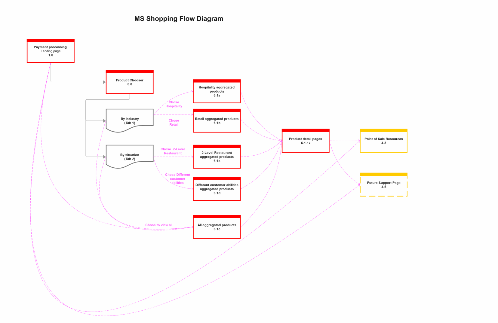
First, figure out the flow
First thing in the design phase was to look at the landscape of this section. What leads into what? What can be handled in a page, how many iterations of device detail pages am I looking at wireframing? This was all handled by drawing out the flow of pages.
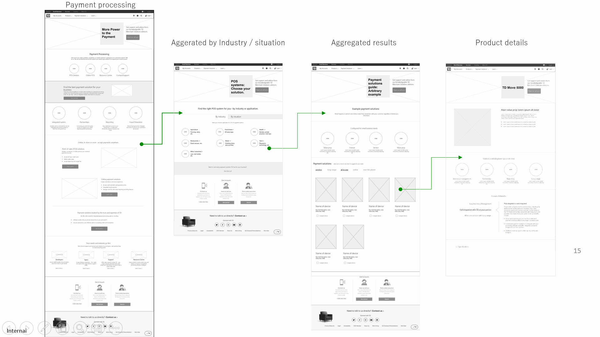
Next, design was applied to the high level wires for presentation to the Merchant Services client.
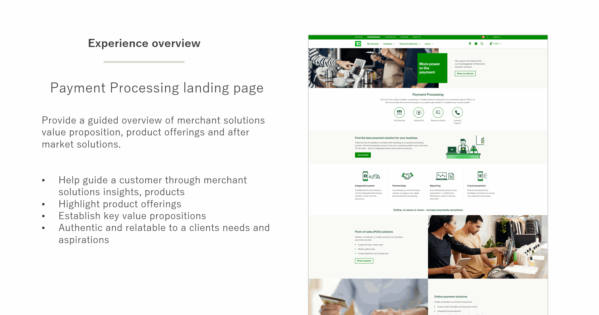
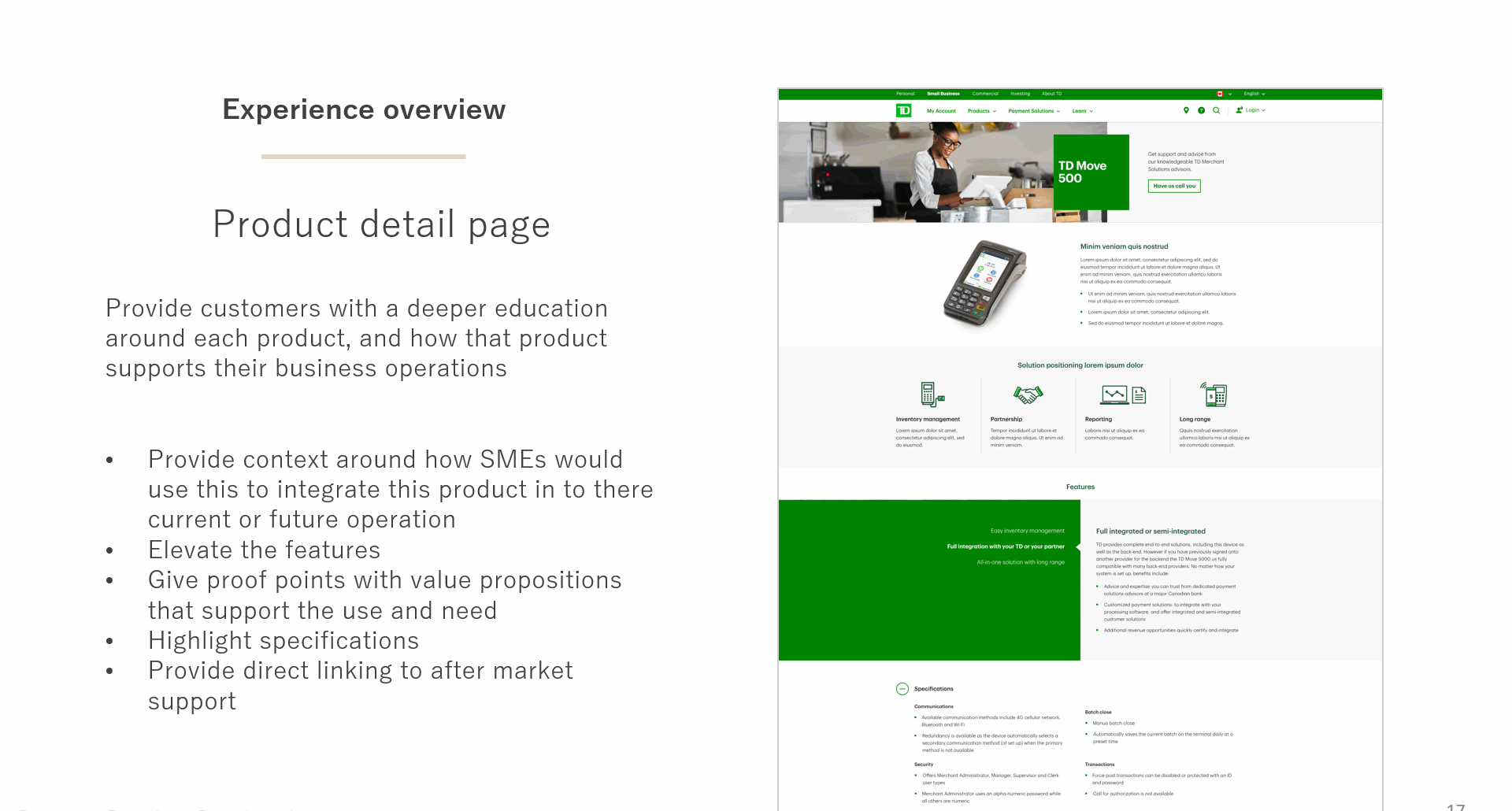
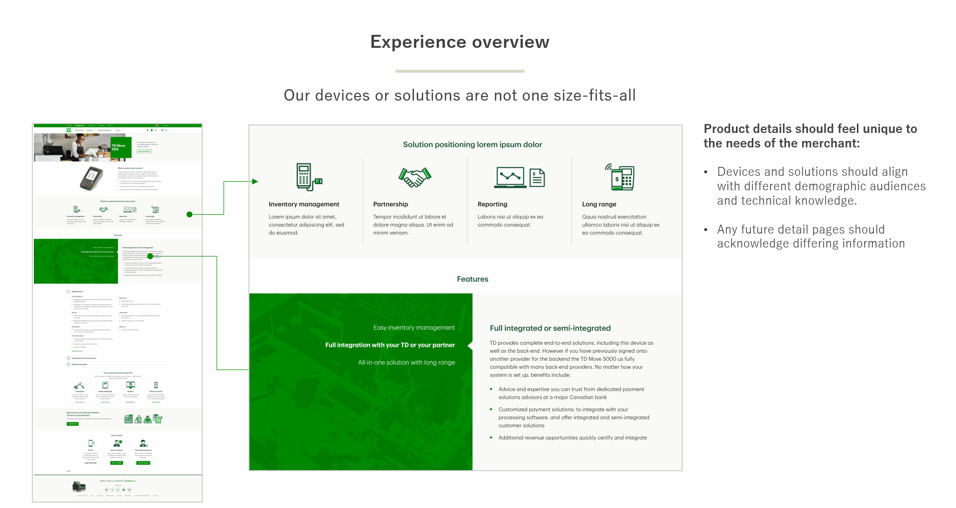
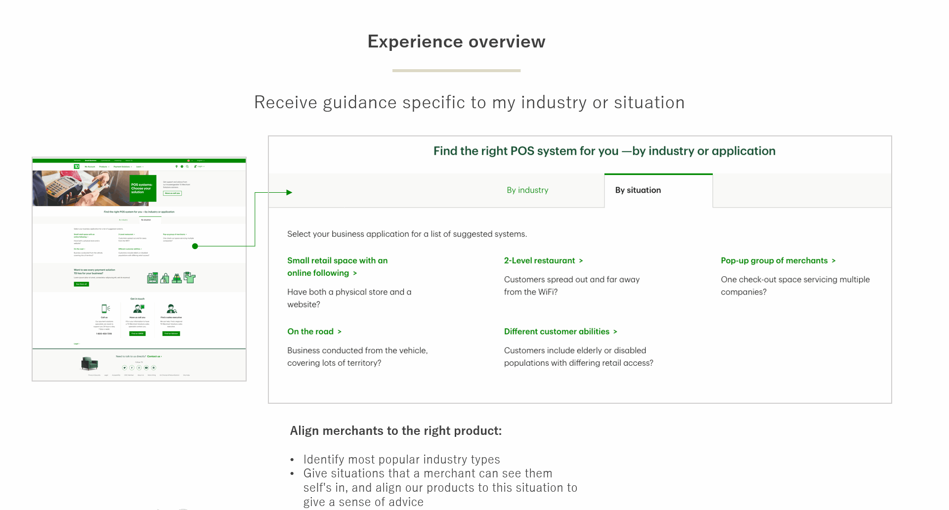
I broke down all the decisions made on each page, to help the client understand why things were done the way they were, and the thoughts behind them. Selections from the presentation are shown below:
Iteration, final MVP wireframes and production
Once the Merchant Services group saw the proposed pages and strategy, they agreed with most of it. The bulk of feedback was about the use cases, reducing them to just 3, which deeply impacted the design. I had to ditch the separate Aggregated by Industry/Situation page; instead, the use cases were few enough in number to be handled on the landing page itself. They still needed salience, so I decided to retain the link on the homepage, but instead of taking the user to a new page, it would bring up a modal with the choices there.
Another thing left out of the MVP were all the device detail pages. Although a big part of the strategy behind the redesign was to make each detail page have a lot more information on it and just be all-around more appealing, they already do exist, so these will wait to be updated when the Merchant Services business group gets new funding for 2022.
The iteration process on the detailed wireframes included an Accessibility review, to ensure the modal worked with screen readers (it did). The new Merchant Services Shopping section is now in the queue for production, with a go live date in September.
Some of the wireframes for this new section are shown below.
